Change colours
Customize your authentication UI theme by defining CSS variables for color palettes.
Overview
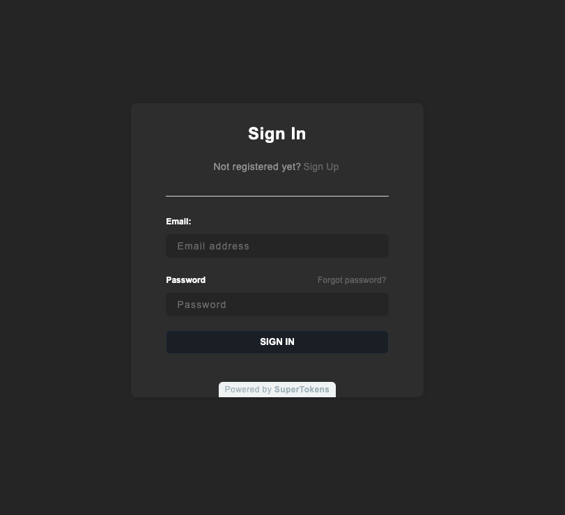
You can update the default theme with your colors to make it fit with your website. Define a few CSS variables in the style property to the EmailPassword.init call.
Specify the colors as RGB (see the following example), because the rgb and rgba functions apply them.
For example, if your website uses a dark theme, here is how you can customize it:
Before you start
Example
import SuperTokens from "supertokens-auth-react";

SuperTokens.init({
  appInfo: {
    apiDomain: "...",
    appName: "...",
    websiteDomain: "...",
  },
  style: `
        [data-supertokens~=container] {
             --palette-background: 51, 51, 51;
            --palette-inputBackground: 41, 41, 41;
            --palette-inputBorder: 41, 41, 41;
            --palette-textTitle: 255, 255, 255;
            --palette-textLabel: 255, 255, 255;
            --palette-textPrimary: 255, 255, 255;
            --palette-error: 173, 46, 46;
            --palette-textInput: 169, 169, 169;
            --palette-textLink: 114,114,114;
            --palette-textGray: 158, 158, 158;
        }
    `,
  recipeList: [
    /* ... */
  ],
});
// this goes in the auth route config of your frontend app (once the pre-built UI script has been loaded)
supertokensUIInit({
appInfo: {
apiDomain: "...",
appName: "...",
websiteDomain: "...",
},
style: `
[data-supertokens~=container] {
--palette-background: 51, 51, 51;
--palette-inputBackground: 41, 41, 41;
--palette-inputBorder: 41, 41, 41;
--palette-textTitle: 255, 255, 255;
--palette-textLabel: 255, 255, 255;
--palette-textPrimary: 255, 255, 255;
--palette-error: 173, 46, 46;
--palette-textInput: 169, 169, 169;
--palette-textLink: 114,114,114;
--palette-textGray: 158, 158, 158;
}
`,
recipeList: [
/* ... */
],
});
Palette values
| Variable Name | Description | Default Value |
|---|---|---|
background |
Background color of all forms | 255, 255, 255 (white) |
inputBackground |
Background color of input fields | 250, 250, 250 (light grey) |
inputBorder |
Border color of input fields | 224, 224, 224 (light grey) |
primary |
Primary color for focused inputs, success states and button backgrounds | 28, 34, 42 |
primaryBorder |
Border color for primary buttons | 45, 54, 68 |
success |
Color used for success events | 65, 167, 0 (green) |
successBackground |
Background color for success notifications | 217, 255, 191 (green) |
error |
Color for error highlights and messages | 255, 23, 23 (red) |
errorBackground |
Background color for error notifications | 255, 241, 235 (red) |
textTitle |
Color of form titles | 0, 0, 0 (black) |
textLabel |
Color of form field labels | 0, 0, 0 (black) |
textInput |
Color of text in form fields | 0, 0, 0 (black) |
textPrimary |
Color of subtitles and footer text | 128, 128, 128 (grey) |
textLink |
Color of links | 0, 122, 255 (blue) |
buttonText |
Color of text in main buttons | 255, 255, 255 (white) |
superTokensBrandingBackground |
Color of SuperTokens branding element | 242, 245, 246 (Alice blue) |
superTokensBrandingText |
Color of “Powered by SuperTokens” text | 173, 189, 196 (heather grey) |